CAPITAL ONE: FIRST TIME VALUE
My role: Senior UX Designer
The Idea
First Time Value takes a small business banking customer through the process of establishing a functional small business bank account. It describes the customer journey beginning with discovery of Capital One’s banking products, through the application process, and finally through account funding and performing transactions.
The Challenges
Replacing the in-person experience
For most small business owners, dealing with financial minutia takes them outside their comfort zone. Many respond to this by establishing a personal relationship with someone at their local bank who will simplify the process. However, those who don’t have a local branch or who don’t want to go there in person will want to manage their banking online. Our challenge was to provide this in-person experience in an online web application.
Not a short process
The process of opening a small business bank account can be rather involved depending on the business’ legal structure. While we determined through research that most small business owners understand this, few users will tolerate a tedious and interminable series of forms.
Providing requirements up front
Banking customers will sometimes begin applying for a new account, only to discover midway through that they don’t have all the required documentation. To set expectations accordingly, and increase the likelihood of a customer successfully completing the application, we needed to inform customers of these requirements as early as possible.
Explaining why
Applying for business bank account requires providing a lot of private data. This includes the social security numbers of you and your business partners as well as the precise nature of the business’ activities. Throughout the process, users are bound to ask “Why do I need to tell you that?” Giving quick access to the answers to these questions without overloading the interface in lengthy tomes of explanation was one of our primary objectives.
Delivering something tangible
When you open a bank account in person, you walk out of the bank with something tangible: an account number, ATM cards, an opening bank statement, something. When you open an account online, you just get pixels on a computer screen. Delivering a reward at the end of this process was what we called “the high-five moment.”
The Solutions
Reproducing the banking conversation
We began by interviewing in-branch bankers to discover how bank accounts are opened in person. Then we worked to recreate this flow in a web interface.

Setting expecations
Explaining the requirements for completing the application process is best done up-front, as soon as we collect the business' legal structure.

Conversational Style
Working closely with our content strategist, we crafted a flow that reads like the in-person conversation between a banker and customer. However, acknowledging that nobody reads anymore, we ensured our content was short and skimmable.

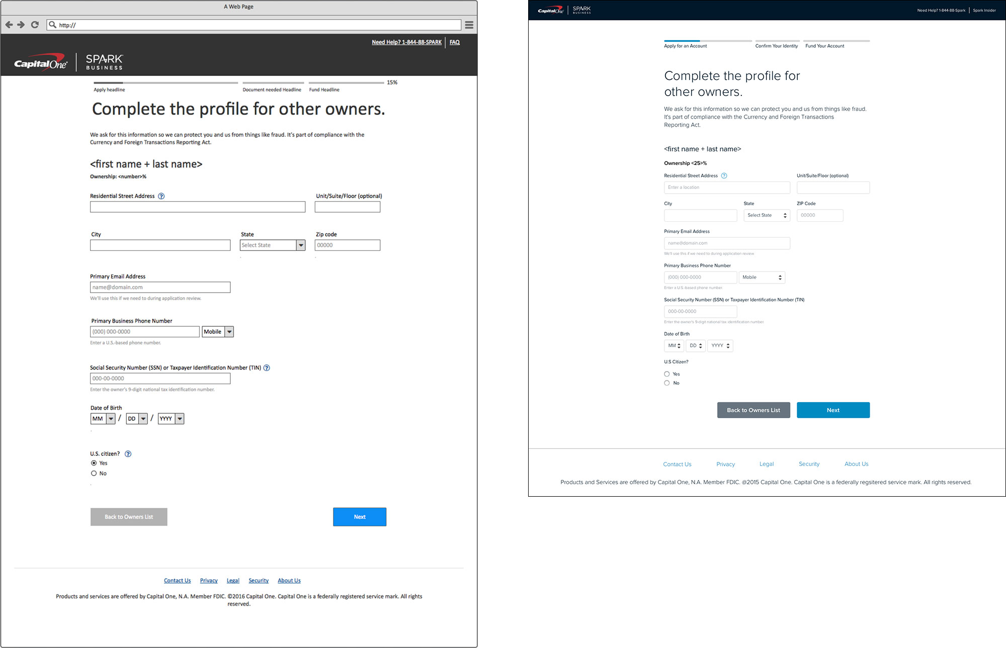
Collecting Owner Information
To reduce the cognitive load of asking for owner information, we first ask just for the names and ownership percentages of anyone owning 25% or more of the company.

Next, we collect ownership details. This step can be particularly onerous, as many business owners do not have the personal tax information about their co-owners. Ideally, we would request this information directly from the co-owners themselves, but technical issues prevented this solution in the first iteration. So we built an interface to accommodate this feature in the future, where the user can either provide the information themselves or request it from the co-owner on an individual basis.