Pandemic Response simulator
My role: Full stack designer
The Idea
How might we help layment understand the dizzying amount of data surrounding the COVID-19 pandemic?
As people struggle to understand the facts around the global pandemic, an enormous communication challenge has arisen. There is too much technical data floating around the internet for a non-technical person to make sense of. Often, that data is interpreted through a particular lens to serve a political agenda. Conflicts and confusion are the result.
Our objectives for the Pandemic Response Simulator were:
- Enable non-technical users to work with the data to understand how it drives results.
- Replace confusion and anxiety with knowledge.
Proof of Concept
We began with a proof-of-concept built via hackathon. Our POC sought to answer one question: what kind of results would our simulation show? Our answer involved these building blocks:
- Data on COVID-19 infections and mortality imported from CDC
- Enabling user modification of key data points
- Animated simulation displaying real-time results
- View the proof of concept (Warning: this version is not pretty)
Design Tenets
The design of the simulator needed to meet these tenets:
- A combination of narrative with numbers: explain what the numbers mean in clear terms
- Focus on the simulation while it's running and hide anything that might distract
- When settings are being modified, pause the simulation and focus on explaining the settings
- Design styles:
- Airy, but not frivolous
- Serious, but not overly weighty
Initial Sketches
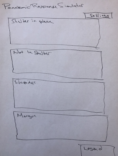


Wireframes


Wireframes helped us determine the following:
- Vertical layout won't work as not everything will fit above the fold.
- Simulator regions* require space between them to accommodate simulator animation.
- Simulator regions need to be arranged together.
- Stats and Feed require less screen real estate.
- Settings button can be better integrated into the layout.
- Modals will be used for shifting focus from the simulation to the settings
Visual Design


Final Design
For the visual design, I applied neumorphic styling to give the UI a soft, modern feel.
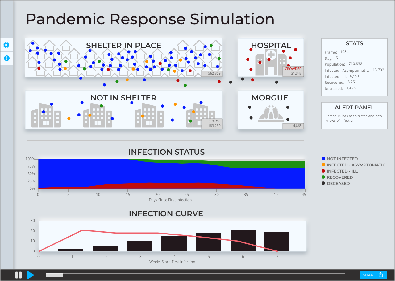
Clicking on an individual in the simulation(one of the dots) displays a tool tip. The simulation pauses and a slight overlay adds a slight focus.

The settings are summarized in the Settings pane. Words are combined with the numbers to provide clearer meaning.

Editing a category of settings occurs in a modal. The simulation is paused, allowing more focus so that each metric can be explained.

Alerts (which appear one at a time on the far right) are collected here in a single feed.

View style guide (Invision)
View prototype (Figma)
Prototype instructions
- Open the settings sidebar by clicking the gear icon in the left sidebar
- With the settings sidebar open, open Illness Rate settings by clicking on the pencil icon to the right of "Illness rate."
- Click Cancel or Save to close Illness Rate settings.
- Click the gear icon in the left sidebar to close the Settings sidebar.
- Open the Alerts sidebar by clicking on the alert icon in the left sidebar.
- Click the alert icon in the left sidebar to close the Alerts sidebar
- Open an individual tool tip by clicking on one of the blue dots inside the Shelter In Place region.
- Click on the tool tip to close it again.
Current Status of the Pandmic Simulator
We get asked frequently when the Pandemic Simulator will be ready to use with its new design. Work is currently underway. However, as this is a passion project for the whole team, development time has to fit in between our regular day jobs. Please let me know if you want to be notified of the launch.